
Just a quick note,** This is not an official rebrand, we chose to do this on our own time to see how we can push ourselves in our craft
Creating a culture behind the brand

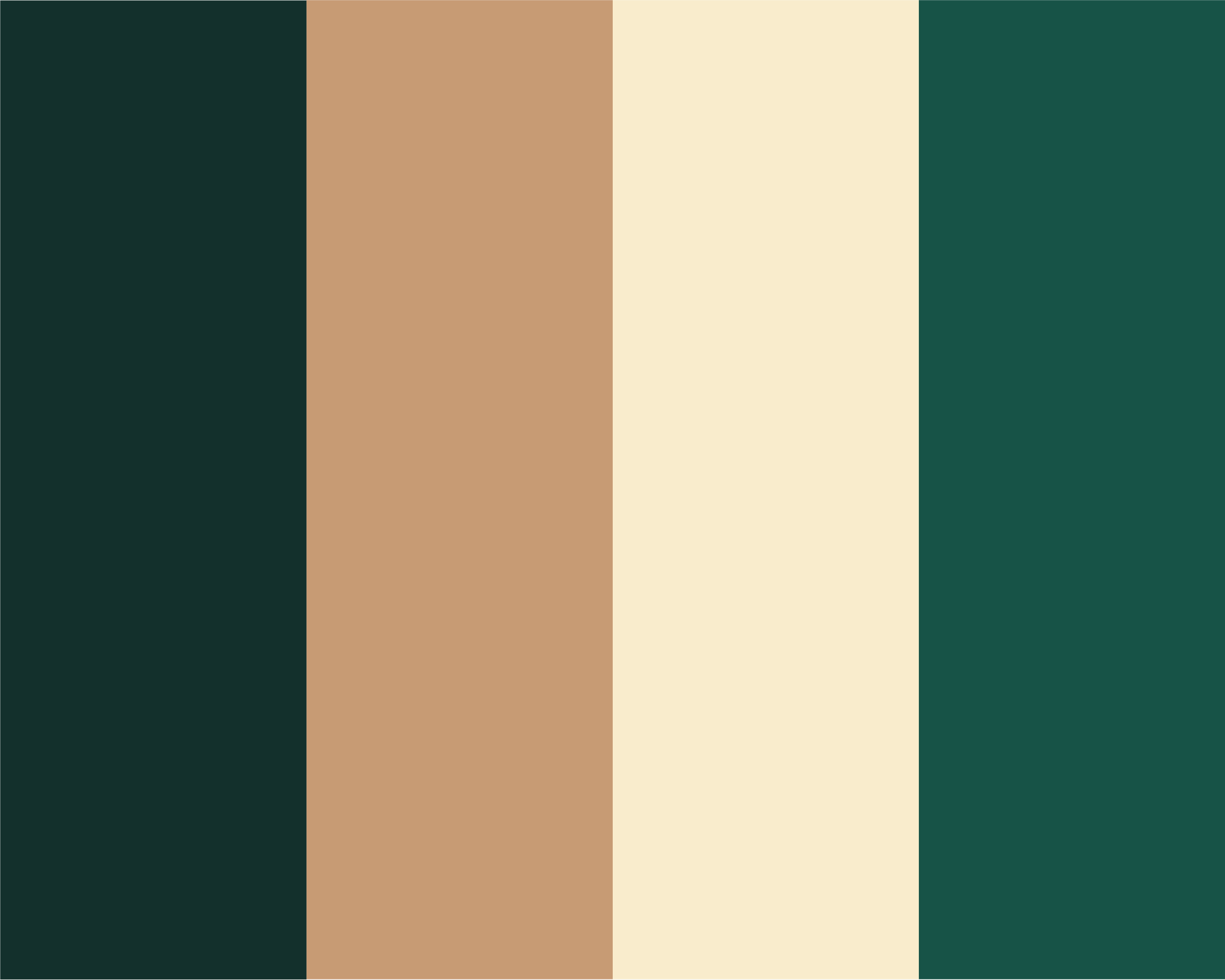
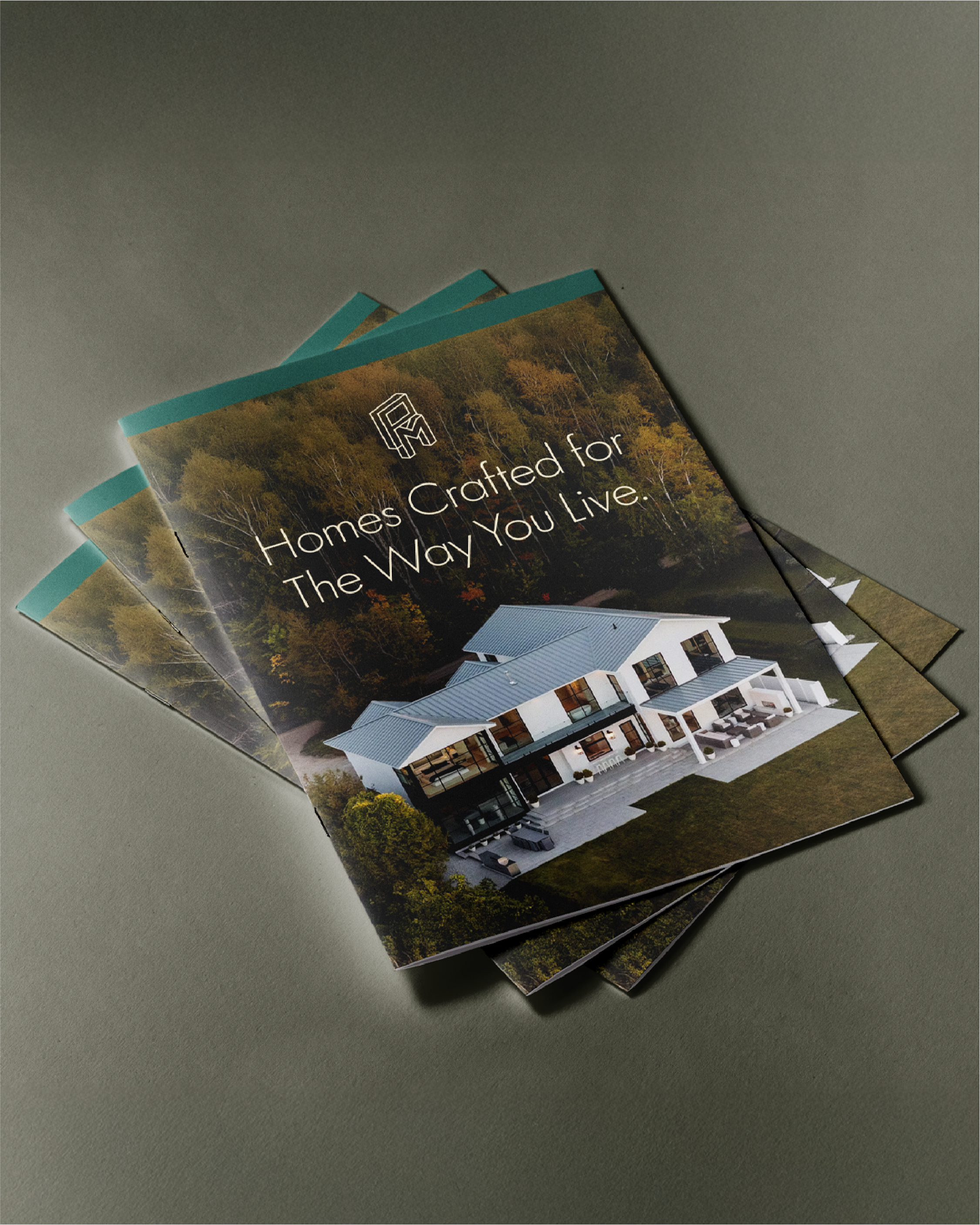
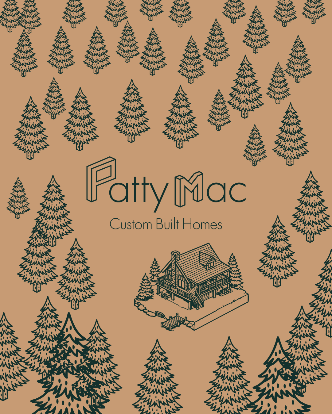
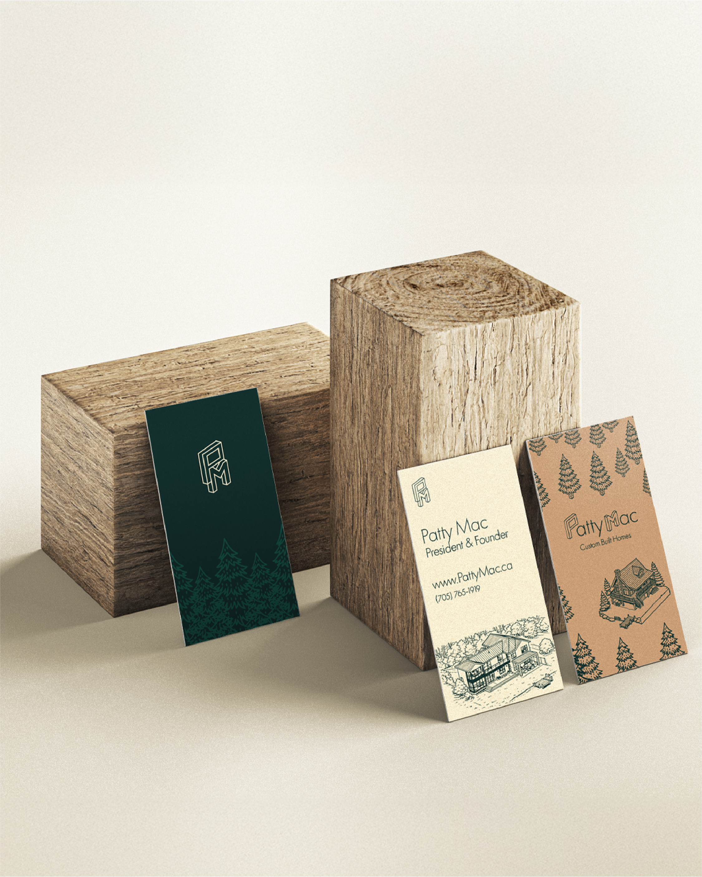
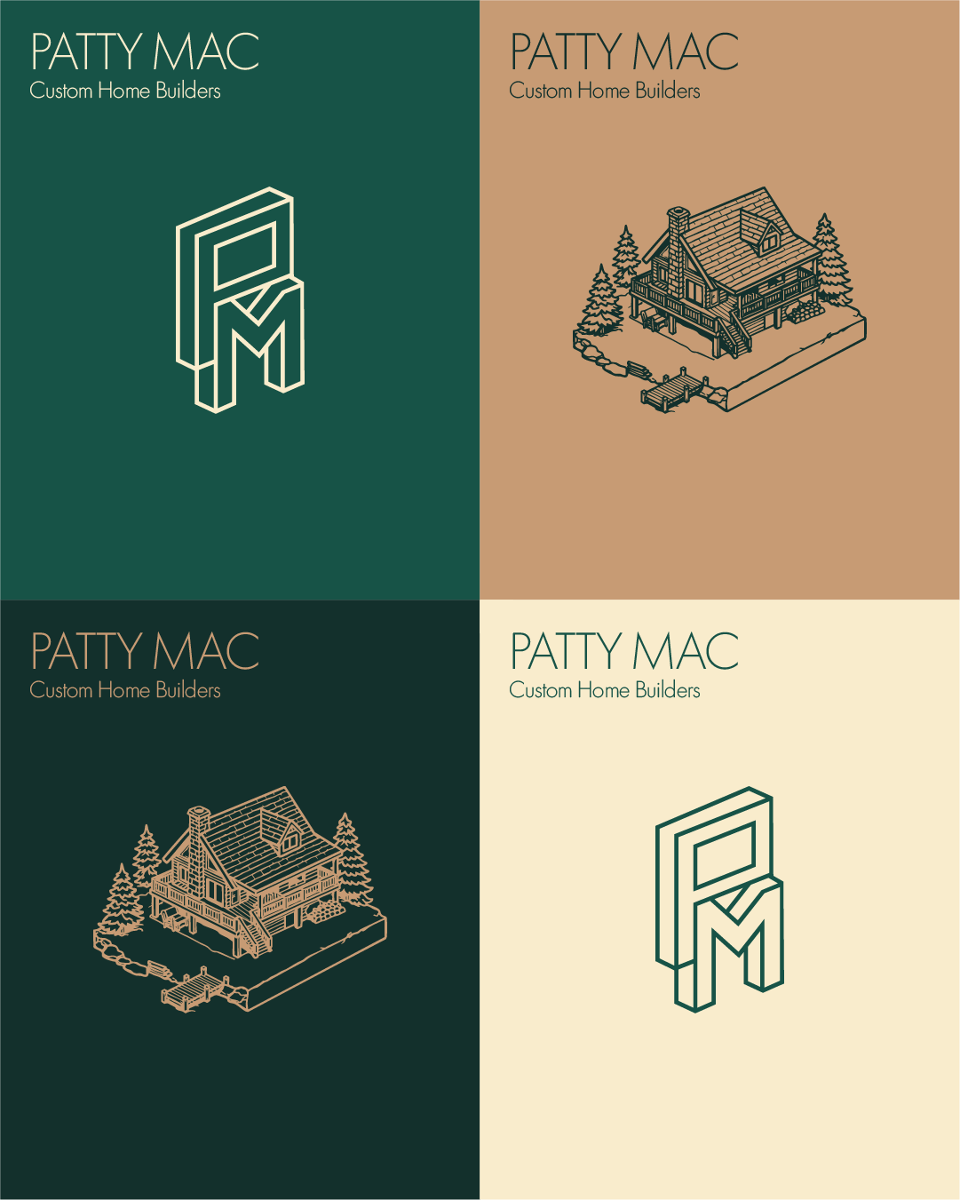
Since most of the homes are in Muskoka or cottage-built homes, we wanted to incorporate an earthy, woodsy colour palette to the brand to feed the soul of custom cottages.
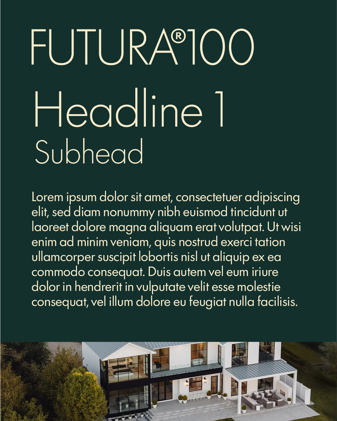
For typography, we chose a clean sans serif in Futura 100 due to easy legibility and to create a modern, luxury classic feel to the brand, while not straying too far away from the woodsy, blue collar feel.
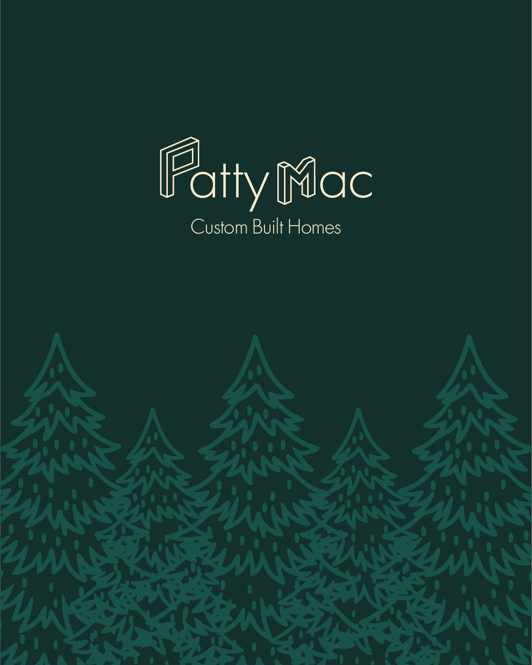
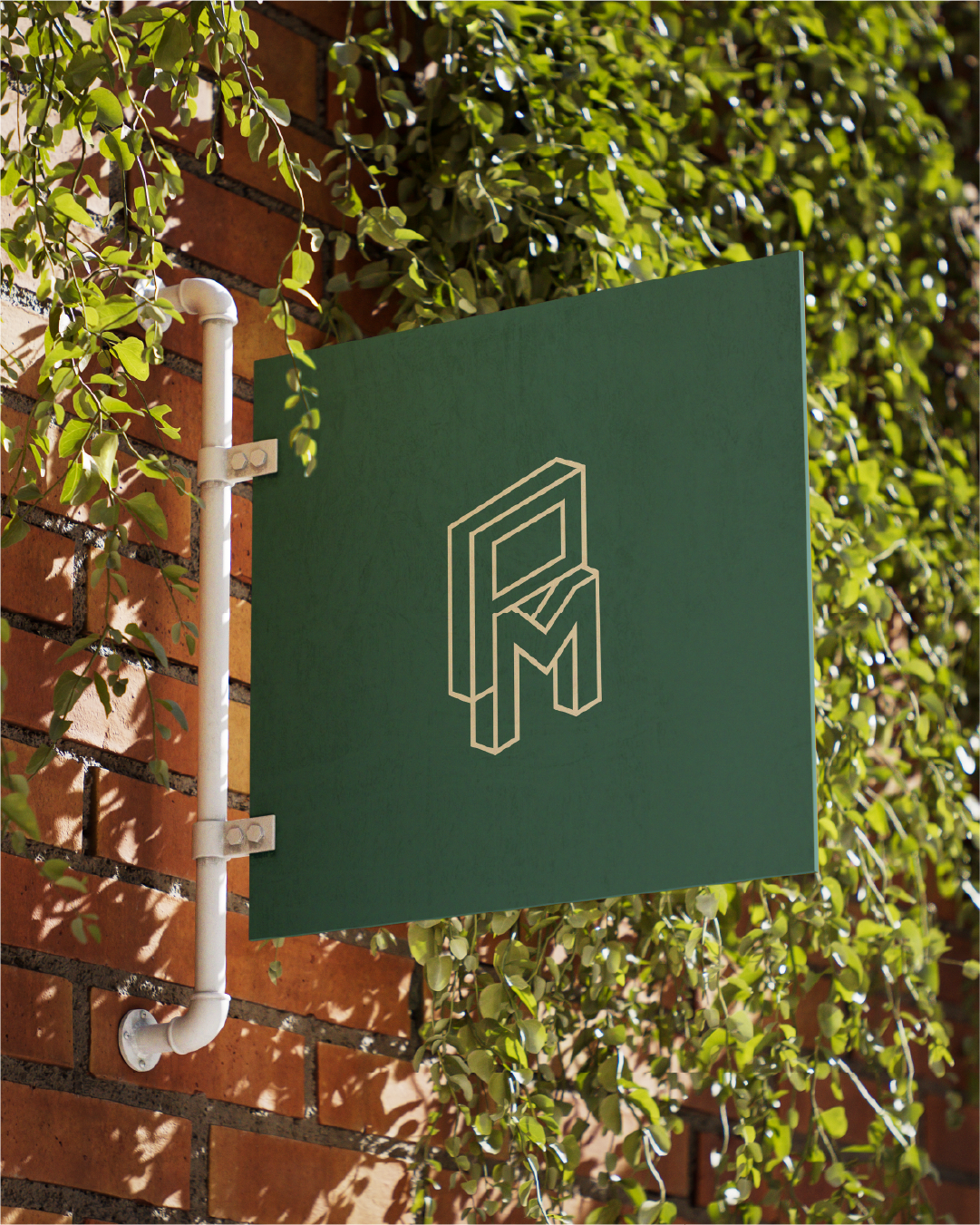
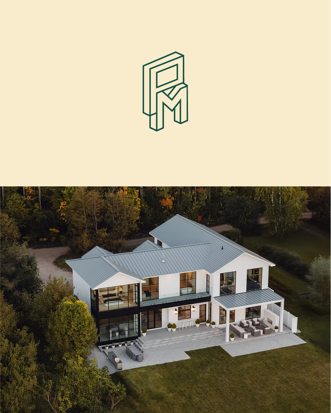
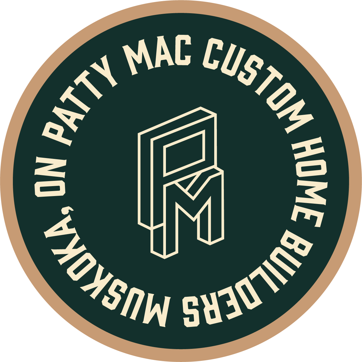
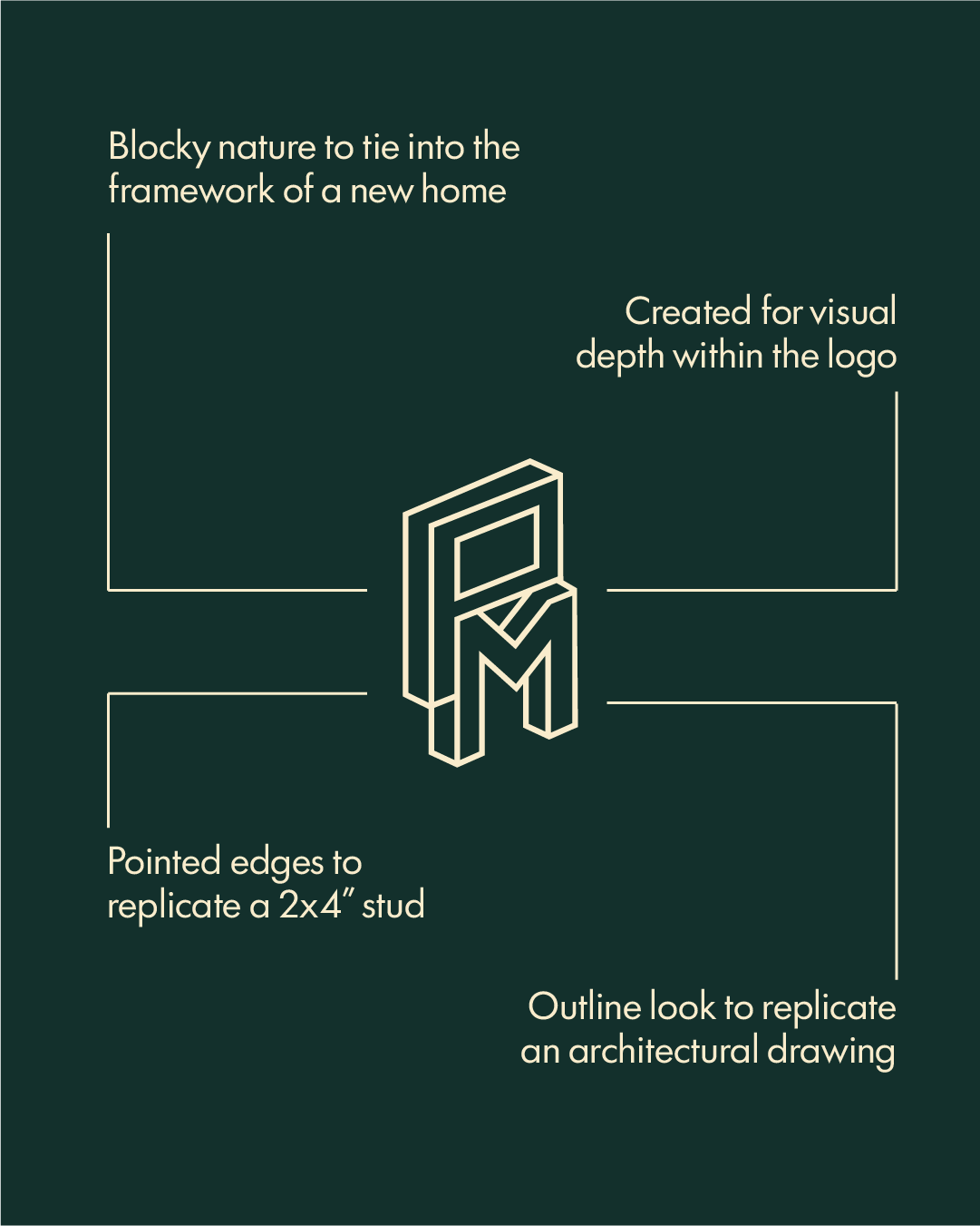
Logo Design
Since most of the homes are in Muskoka or cottage-built homes, we wanted to incorporate an earthy, woodsy colour palette to the brand to feed the soul of custom cottages.
For typography, we chose a clean sans serif in Futura 100 due to easy legibility and to create a modern, luxury classic feel to the brand, while not straying too far away from the woodsy, blue collar feel.
Colour & Typography